Disclaimer

Black Dragon is MY Viewer, i decide which feature i want to add and which to remove, i share this Viewer to show the world that user base size is not important, i do rate quality by effort, thought and love put into the project, not some rough estimated numbers. I consider feature requests only if i you can name proper valid reasons i can agree on. It is my (unpaid) time i'm putting into this project, i'm not here to cater to every Joe's desires.

Friday, August 23, 2013

Alpha 2.3.1

A little bit late but better late than never!

2.3.1 is here to quick fix a bunch of reported problems, mainly your Voice problem.

It also fixes the Inventory sort buttons beeing unfunctional, show parcel properties/coordinates missing in topbar menu aswell as the whole mini locationbar which i was originally going to remove entirely aswell as the ability to disable the favoritesbar and removes the worn tab aswell as the misleading 2x/4x/8x/16x Antialiasing types which don't work as FXAA only knows On and Off in SL and it also removes the RLVa menu as RLVa is NOT part of this Viewer anymore, for now.

As always, be sure you delete your settings when coming from pre-2.3.0 versions.


BTW, the world is a Torus type and i found it's end.


Changelog:


2.3.1 Alpha

Added: Show Parcel Properties and Show Coordinates menu entries to the Topbar menu.
Fixed: Inventory Sort-by functions.
Fixed: Mini-location bar layout and made it correctly push and retract the FUI.
Changed: German Item Count display styles.
Removed: Inventory Worn tab, for now.
Removed: 2/4/8/16x AA and replaced it with On/Off.
Removed: RLVa Menu from "Dragon" Main Menu, for now.

Wednesday, August 21, 2013

2.3.0 Alpha

NOTE: Voice isn't working, i'm aware of that and i'm able to reproduce it. It seems to be coming from the inability of your Voice to connect and identify on the Voice server because of a missing CA file, which i took out on purpose because when i privately send the release to someone to test he/she said something about it, not sure what but i guess it plop'd up something. I guess the Voice exe needs this certificate to get permissions to connect which could be a change introduced with the latest Voice "enhancements" which i also merged in my Viewer. I will release a fixed version today which will contain this certificate, don't be surprised if it pops up a suspicious Windows dialog or something... i will ask Oz what is going on and why this CA file seems to be needed. Thanks for your feedback

It's finally there.

Lots of work and fixes have passed into this version, it was literally redone from scratch. No really, it was.

This version features full Materials compatibility, lots of fixes for it, fully functional alpha's, snapshots up to 16.384*16.384, Deferred Rendering underwater, fully functional Depth of Field underwater, optional Depth of Field while building to build with Depth of Field in mind and/or prepare the scene better for Depth of Field, Tone Mapping and Color Correction, fully functional Post Process Glow (again), the Animation Time Factor feature, the original Deferred shiny and lots more! For a more complete list of changes look at the changelog or the feature highlight list.

RLVa was removed in this process to ensure maximum compatibility until RLVa updates.

Nirans Viewer:


Dead. It's dead, leave it alone, it was planned to die as of yesterday, sadly it didn't. It works fine with SSA, i still consider it as dead as it doesn't support Materials and all the SSA fixes, it only supports about 1/8 of SSA. If you insist on using it, do so but i will prevent it from logging in soon.

And stop telling me but Nirans looks so much better graphics-wise. No it doesn't. I know it because i made that Viewer and i made Black Dragon, i know what both can do. You just don't know how to utilize it. Fact is even if i give you easy access to all the super finetuning options most of you run around in circles, crying because you don't know what to do, you then end up asking me how i do my snapshots. It's really not that hard to slap some nice graphics on a picture in SL with any Viewer.

Anyway.

R.I.P


Features:


Animation Time Factor
Enhanced Shadows
Enhanced SSAO
Fullbright toggle
Machinima Sidebar
Materials + enhanced Materials tools
Url tags
Underwater Deferred
Underwater Depth of Field


Snapshots:


Changelog:

2.3 Alpha (not complete)

Added: Small Icon button mode to Toolbars. Finally.
Added: Text Only button mode to Toolbars.
Added: MapChatRingColor Color to Colors.xml for our Chat Range Rings.
Added: Slow Motion Time Factor feature.
Added: Machinima Sidebar and toggle.
Added: All new LSL functions and keywords.
Added: Long missing background texture for the login.
Added: Anisotropic Filtering to DoF. Need a direct 1:1 comparison to tell the exact differences tho.
Added: Shadow calculation "optimizations", make them appear sharper to counter our high shadow blur debug, this way we keep shadows sharp but SSAO super smooth.
Added: Avatar counter to SIM name on World Map.
Added: Feature to prevent the Viewer from receiving any Fullbright information. (Fullbright toggle)
Added: Feature to load/save camera positions.
Added: Third Person Mouse Steering mode, toggable via "V" key.
Added: Missing Down Arrow icon.
Added: Missing start at: SIM-selection dropdown.
Added: Updated and added the new Nvidia GTX 700 series.
Added: URL types for RGB, bold, italic and underlined text.
Added/Changed: Autohide chat and hide on return, some little behavior finetunings, don't remove screenchat when we open chat and only autohide when history is closed.
Changed: Default FoV from 1.047 to 1.10.
Changed: Default Toolbar layout to my every day layout.
Changed: Chat Range Rings behavior, we now show shout and whisper range of our own Avatar and chat range of everyone.
Changed: Default Depth of Field settings to a Real Life camera inspired set.
Changed: Layout of CHUI a bit, realigned everything, removed lots of spaces and made it look less like a total clusterfuck.
Changed: Default Bandwidth to 10.000.
Changed: Force the Chat editors into single line mode.
Changed: Experimental Login background to my newest video.
Changed: LSL function color to match the dark script editor skin.
Changed: Moved the IM tabs to the right side and made some small finetuning changes. Might need some code adjustments for better resizing.
Changed: SSAO Render Algorythm, using Tofu's again.
Changed: SSAO and Shadow Debug defaults.
Changed: Shadow calculation changes for way more detail and way less pixelation, comes at its limits on super low sun position just like any other shadow calculation.
Changed: Viewer Icons, this time mostly correct, Viewer application needs to be renamed to anything else than the original to make everything apply correct.
Changed: Tone Mapping default offsets to prevent extreme darkness with the new Materials fixes.
Changed: Preview Texture layout, made it smaller and realigned everything.
Changed: Play sound previews as SFX sound instead of UI sound.
Changed: Reorganized the whole Face/Texture tab in build tools to show all 3 texture pickers at the same time, alot changes were needed and some bugs needed to be fixed which were happening because it was never intended to be able to see and use all 3 pickers at the same time. Needs some heavy cleanup and some optimizations maybe.
Changed: Debug names for Underwater rendering features.
Changed: Field of View max value to 200.
Changed: Allow wnderwater Depth of Field rendering.
Changed: Progressscreen progressbar style and layout.
Changed: Several layout and style tweaks for Outfits panel. WIP
Changed: Click to Walk off by default.
Changed: Terrain Texture Quality doubled by default.
Changed: Media autoplay disabled by default.
Changed: Wrong Debug descriptions.
Changed: AFK Timout to 0 (never) by default.
Changed: Channel to Black Dragon.
Changed: RenderGlowResolutionPow to 10 by default, make Viewer NOT change that ever.
Changed: Allow Snapshots up to 16.384 * 16384.
Changed: Zoom out/in steps are alot smaller now.
Changed: Default color of our own chat to white.
Fixed: Glow always breaking on first start, stabbing with a knife works. Always.
Fixed: If-logic problems causing DoF to not work right.
Fixed: Camera Field of View not returning to user set value after leaving water.
Fixed: Field of View option in Machinima Sidebar not working.
Fixed: All attachments going to the "Chin" attachment slot beeing broken and shown broken to everyone like they do for me for an unknown reason.
Fixed: Topbar background image for 1.0+ UI sizes and 1920x1080 or lower resolution combinations. UI size below 1.0 with 1920x1080 still bugs out, but wont fix until someone reports it as bug, i dont see the necessarity in adding another image for everyone of which 1% will ever see it if at all.
Fixed: Several overlapping widgets in german UI and aligned the whole build tools a bit, also cleaned up a bit. More cleanup will follow someday.
Fixed: Statusbar and/or its contents not hiding completely when in mouselook.
Fixed: Parcel Selection not uptading correctly when the same or another parcel was previously selected.
Fixed: Home Teleports via Home button showing the progress screen when we are already at home.
Fixed: Camera Spin via Alt + E/C not working correctly when sitting on an object.
Fixed: Open/Close double arrows appearing as grey untextured block.
Fixed: Diffuse color picker not beeing selectable.
Fixed: Texture Console layout.
Fixed: World Map layout, For Sale icon and People checkbox.
Fixed: Send IM menu callback with Compact History mode doesnt work.
Fixed: 180° Field of View for Depth of Field is our maximum at it totally blurs the whole screen. Also fixed a wrong initial value.
Removed: SH-1912 environment shiny completly until there is some way to seperate "shiny" and environment reflection.
Removed: "Press ESC to return to World view" label at the bottom when in Mouselook.

Monday, August 12, 2013

12. August Update

Today i worked some more on the Viewer burst wise, got some things fixed, no release planned however.

I added the new URL tags again allowing us to write in red, green, blue, bold, italic and underline again.


I added the save/load camera position feature again.

I changed the the Texture Preview floater layout, fixed it up and made it use less screen space =D


I changed sound previews to SFX sounds, muting the UI will now still play sounds when you play them locally.

I fixed the color picker for Diffuse textures.

I changed the layout of the Texture Console so it doesnt look all weird and overlapping anymore.

I finally came around to add the double arrow texture for the World Map/Snapshot floater and also fixed the World Map layout aswell as the "For Sale" icon.

I removed the "Press ESC to return to world view" label in Mouselook which is extremly annoying and totally destroys immersion...like a watermark...

That's it for today! Going to play some more Guild Wars 2.
Niran

Friday, August 9, 2013

8. August Update

What is Niran doing when he's not playing games?
He's beeing lazy ofcourse!

*shakes head*

Compared to yesterday's yesterday (7. August) this was a super productive day. For some strange reason i felt very good and wanted to implement lots of stuff... so i opened up my Nirans Viewer repository and went through everything, commit by commit to see what i havnt yet implemented... and implemented them on first sight... until.... SPELUNKY HD CAME OUT ON STEAM! Which i obviously had to play with my brother then. Sorry.

So what did i do?

First things first, i made the Topbar hide correctly and completely when we enter mouselook.

I fixed a parcel selection bug, whenever you tried to select another parcel while having one already selected there was a very high chance that the selection wouldn't update, which is annoying as hell as you have to close all About Land floaters and make sure nothing is selected before you select another parcel.

I fixed a little logic oversight that caused the progress screen to appear whenever you teleport home via "Quick Home Button" in the Topbar, basically our Home TP is a TP via landmark, TP's via landmark always cause a progress screen. Which means i have to fix landmark TP's in general too, maybe today.

I fixed a long standing bug that someone from Fluffy noticed long ago and told me about, rising or lowering your camera with E or C when sitting on an object caused strange movements or didnt work at all. Not anymore!

Then... i re-implemented this:


Avatar counter on the World Map just like in Nirans Viewer :P

Last but not least, Fullbrights. I re-implemented the Fullbright toggle, allowing you to prevent your Viewer from receiving any fullbright information resulting in no Fullbrights in your scene.. woooo!


Well, i guess that's it for the 8th of August.
Niran.

Thursday, August 8, 2013

7. August Update

Unproductive day.
very...
very...
very...
unproductive day.

The only change i did on 7. was basically swapping out the icons oft he LL Viewer for my own, took me some time to get it halfway right... and still it bugs. Everything is fine except when you start the Viewer it uses the default Windows "application" icon. Anyway... it's not important, time to do some more changes in other parts of the Viewer.

Niran.

Wednesday, August 7, 2013

6. August Update

I kept myself busy today with finetuning.
Not much, the outcome doesnt really make me happy.

I'll start some theoretical tech talk why i'm very limited here.


                                                    Warning: alot assumptions here!                                                   
As far as i've seen there are several ways to make shadows work, ofcourse one more performance eating than the other, most games seem to use a fixed, often very high resolution shadow map, how can they manage to have such nice shadows without totally overkilling your performance? Well... Second Life has no boundaries, our camera is free, the world is free, we can move and look whereever we want as close as we want, other games often don't allow such a huge amount of freedom for a reason... what if we were able to look very close at our shadows? at our textures? at everything? we would find out all the tricks and hacks developers use to make our games look good without killing your performance, one of these tricks is the shadow map, shadows can be a performance eater, especially if rendered in realtime... did you ever notice that Second Life renders all these in realtime? projected lights, realtime...sun shadows, realtime... games often use "baked" shadows or very very low resolution shadows for let's say interior scenes, shadows from the sun are baked into the textures or map and never change or move or do anything at all, only "projected" lights from light sources use realtime calculation because it saves alot performance. Second Life does everything other games possibly do as a pre-baked texture, in realtime resulting in a huge performance drop which is probably one of the many reasons Second Life doesnt currently allow more than 2 shadows from projected lights.

What else do games do different with shadows? well, the biggest shadow which in this case is the always, everywhere-existing sunshadow is often a pre-baked texture leaving alot memory und processing power for the other shadows, allowing them to be rendered at a way higher resolution.

Can't we just turn up the shadow resolution? we could, we have to, to counter pixelation caused by our high draw distance but that again will decrease performance drastically... but why do we have to turn up the resolution with higher draw distances? why does the draw distance decrease our shadow resolution at all? It doesn't!

Again, this is alot of assuming now, i don't know how it exactly works but i don't like the theoretical code stuff anyway, i go for what i really see and what i see is:

We have a shadow map. This shadow map has a given resolution, let's say the same resolution as our rendering resolution. 1920x1080. Imagine a prim with a 1920x1080 picture on it.
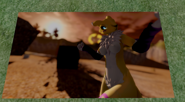

This 1920x1080 picture is our shadow map, we put it on a 1.920m x 1.080m prim, perfect size for this resolution, it's not too big and not too small, you can see all details and the picture is super sharp. This prim is our draw distance of 64m. What happens if we resize this prim to 2x size? right! the texture will (if we ticked the option for it) resize with it, our texture will become stretch over the new size of the prim, let's say 3.840m x 2.160m, double the size than before, but our picture is still only 1920x1080 resulting in it becoming "stretched" or pixelated on closer (or same zoom level) investigation. Same for our draw distance, if we pull our draw distance up to 128m our shadow map will still stay at 1920x1080 resolution but has to be layered on a surface that is twice as big as before, resulting in shadows becoming more pixelated. We could resize our prim (draw distance) to four, five, ten or twenty times its original size, our picture (shadow map) will always stay the same resolution but has to be layered on a surface becoming bigger and even bigger. Ever stood in front of a huge 64m flat surface that has a 1024x1024 texture on it? its SUPER blurry (pixelated) if you look at it from a normal angle and zoom level, to make it look good again you would need to zoom far out. Exactly the same is happening with out shadows.
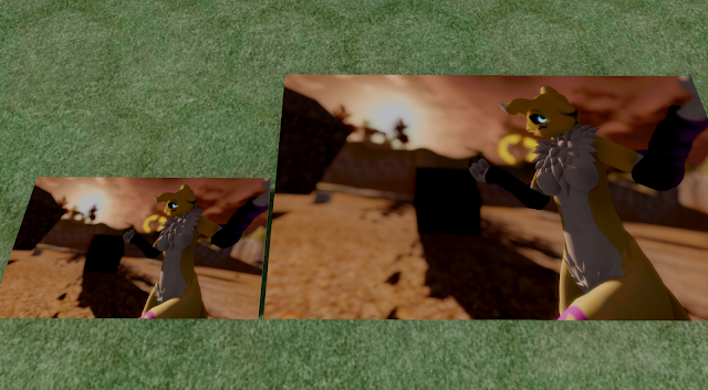

Basically we would need to double the resolution of our shadows for each time we double our draw distance, that means 64m = 1.0x , 128m = 2.0x , 256m = 4.0x , where 2 times is often already the moment at which most GPU's will say fuck you and bail out or only produce single digit framerates even on low draw distances.

So what can we do? nothing. Absolutely nothing. I remember the shadows in Viewer 1 working the other way, where the shadow map resolution scaled (probably) exponential with your draw distance, resulting in them hardly changing their quality but decreasing framerate drastically with an alarming speed. Heres a picture to show you how that would basically look like, note that those textures are web-media faces and are snapshots i took, thats why they dont scale that good, you might not see it but the texture repeats vertically too.


I hope you understood at least a little bit of what i was trying to explain...
anyway, lemme know if i should implement a feature that automatically scales your shadow resolution with your draw distance in the future.

That's it for today!
Niran.

Tuesday, August 6, 2013

5. August Update

Time for calibrations.

I spend my day optimizing shadow calculation a bit for more optical fancyness, the results are pretty good, they fail on high draw distance and low sun position however, like any other shadow calculation i've seen so far.

Those changes include both smoothed sun shadows aswell as projected shadows from lights.


The original (left) obviously lacks some sharpness, additionally to its low resolution its also super blurry and this is a pretty small and tight (low FoV) light.

High resolution snapshots, low to mid draw distance and high shadow resolution snapshots will benefit the most from my changes, as you can see below.


First, this is the default shadow look with an already very low sun position but 64m draw distance and normal shadow and snapshot resolution.


Second, this is a snapshot with the shadow resolution set to 2.5x the changes are obvious, small detail shadows become more visible and ofcourse the shadow resolution increases by 2.5 times resulting in smoother shadows.


Third, this is a snapshot with the previous 2.5 shadow resolution and 4k snapshot resolution, the shadow quality speaks for itself i guess, super crisp shadows even on my mouth, this is what i consider high quality shadows. Most games have a way lower resolution for shadows than SL has, they just cant look at them from all angles, positions and zoom levels.


This is pretty much the finishing touch, i consider this overkill mode, shadows set to 4.0 times, and 4k resolution snapshot theoretically resulting in a ~16.000x10.000 resolution shadow map, thats just insane and it shows, even those small and thin hair prims clearly visible shadows and the shadow quality and smoothness is absolutely unmatched. Crysis & co would be proud of this level of detail.

One last note is that even tho my hat is positioned so close to my head and the sun is in a very low position, shadows of my hat don't cut off on my head like it is with LL shadows, sometimes even on default day preset.

If i ever get around to implement my promised "Overkill" mode, it will set everything to a similar if not higher level of the last snapshot. I swear to god this will make all GPU's burn in a hellfire, say goodbye to your 2 digit framerate.

Apart from that i removed SH-1912, again. I hate those extraordinary ugly environment reflections in dark places where no light can possibly fall logically creating such a reflection... it looks ugly and unnatural... much like fullbright does.

Depth of Field was also "enhanced" a bit, just a tiny bit. Probably not visible in these snapshots but DoF is generally less pixelated when using very very slight Depth of Field (when Depth of Field starts appearing as example).

Thats it!
Niran.

Monday, August 5, 2013

4. August Update

Yesterday i have been slowly working on finally enhancing the horrible default graphics again.

First of all i had to port Tofu's (Tofu Buzzard) better SSAO again which looked extremly overhelming at first because i was totally stressed and annoyed by a guy... after looking a few times it turned out to be an easy task, luckily i made a clean commit back when i started Black Dragon, that made everything alot easier. After porting his better SSAO i was finally able to use my own SSAO settings from Nirans Viewer again without making everything look like a black mist-y mess. I'm not quite happy with it, it could be a little bit smoother still but that could be just my imagination or me not beeing used to a way stronger SSAO.

I also fixed all my "chin" attachments going crazily off and beeing centered on my skull, literally breaking all my chin attachments like jaws of nearly all my avatars... not sure what caused it but everyone was able to see my jaw beeing attached in the center of my skull which isn't actually one of the funniest things i've seen in SL so far.

That's it.
Niran.

Sunday, August 4, 2013

3. August Update

Yesterday.

Not very much happened, nothing much of interest for you users but alot for me basically.

On wednesday i opened OPEN-196/STORM-1960, in hope i could bring in some large scale visual optimizing of LL's current XUI/XML files. Sort, align and generally clean them up, make use of all the new fancies of the V2 User Interface everywhere where possible and therefor take a huge load fuckups and just throw them into the trashbin so we can finally forget about them and get a well organized User Interface, at least internal in XML. Nothing you would probably ever see but a clean XML file also means it's easier to read, faster to edit and most important, it's easier to understand for new people, which would have been a chance for many new modders to take a look into these files and start modding, creating new User Interfaces or Skins.

That was the plan... until...
Oz Linden wrote a comment - 02/Aug/13 5:56 AM 
Ok... slow way down. I said this in email to Niran, but it didn't take, so I'll say it again here:
We are absolutely not going to do large scale reformatting of XUI now. Period.
Well. Guess that's it for the big part of this project. Again the one guy who slung me into the jira creating process, is the chosen one who decides to pretty much kill this whole project. Thanks Oz. I think i just havn't explained my project enough beforehand otherwise you wouldn't have told me to open a Jira ticket for it just to "kill it" shortly after.

Oz named a few issues why this isn't going to happen anytime soon but his issues are issues that will exist forever, basically saying that this part of the project (which is the biggest part and basically the part that made me start all this) is never going to happen. I think those issues are just trivial, they are issues we only have to fix once but again my project was probably just planned way too large, sorry but i can't get happy with things like "oh change this X to Y for religious reasons..." things. I want to enhance Second Life where i can, where my few available skills become really usefull, where i am in my nearly unbeatable element.... but let's not get into that again.

So what did i actually change? Only 2 things, one because so many people wanted it and it was so easy to implement (even a total noob could do it in basically every Viewer).


It doesnt need words, doesnt it?

Other than that i implemented (during my livestream) the Animation Time Factor feature which i introduced over a year ago in Nirans Viewer.


It allows you to customize the playback speed of an animation, even negative values are possible making your animations play backwards! I used that feature here for example:


That's it for today :/ havn't done anything else.

Niran.

Thursday, August 1, 2013

31th July.

Yesterday (here) was another fine day with some changes =D

I spend the whole morning fixing a bug which was never meant to be seen due to the way the current Materials "Texture" tab works. Basically i allowed all 3 Texture pickers to be visible and editable at the same time, we still need that selection however for those texture attributes like horizontal offset, vertical offset, repeats per meter/face etc. The bug happened when you selected anything else than diffuse map and tried to apply a diffuse map, instead of applying a diffuse map it always applied the currently selected texture type, that is caused by how the diffuse map is set in code, normal and specular maps are new and their code is too, they got a completely seperate and very specialized way to be applied, the old default diffuse map doesnt, it just uses the "current" texture channel, in this case the currently selected texture type and applies it to that, that is because the "Texture" tab always had only one texture type active and visible, you couldnt set a diffuse map without selecting diffuse type first, that circumvented this issue, it took some time to find the booboo in this huge mess but hey, its fixed now!

Sammy (previously from Exodus) also came up with a very nice idea, all texture offsets should be "lockable", so editing diffuse map texture attributes will automatically apply those values to specular and normal map aswell, that saves you selecting the other texture types and doing this manually, theres virtually no case where you dont need that, so IF i do this (which i will try at least) the locking feature will be enabled by default and can then be disabled.


So what else did i do? You wanted a fix for the topbar background, i made it. It fixes the topbar background for the following resolution/UI size combinations:

smaller than 1.0 = 1920x1080 by UI Size (1920x1080 x 0.75 etc).
1.0 = everything up to 1920x1080.
bigger than 1.0 = up to 1920x1080 and beyond with 1920x1080 by UI Size (1920x1080 x 1.2 etc)

That is because of how the UI scaling of fixed widgets and their possibly non-repeating art works.

Look at the pictures and take a look at the topbar background:


What did you notice? probably nothing. At my UI size the hexagons and the whole texture is alot bigger, basically pushing 20% (because of 1.2 UI size) of its texture out of the screen as it is scaled proportionally. In simple terms that means i have less hexagons. Smaller UI = more hexagons... up to the explained max. I will NOT fix it for smaller UI sizes until someone complains about it as it needs me to either increase the size of that texture, using more memory or adding another topbar background texture at the end, increasing the unnecessary widget count by 1 and taking precious performance (maybe).


Last but not least, i updated the Viewer to the latest Materials repository, not sure if stuff looks better or worse now as my eyes became alot brighter, i dont care much anyway i still look cute.

That's it for today!
Niran.