Disclaimer

Black Dragon is MY Viewer, i decide which feature i want to add and which to remove, i share this Viewer to show the world that user base size is not important, i do rate quality by effort, thought and love put into the project, not some rough estimated numbers. I consider feature requests only if i you can name proper valid reasons i can agree on. It is my (unpaid) time i'm putting into this project, i'm not here to cater to every Joe's desires.

Thursday, August 1, 2013

31th July.

Yesterday (here) was another fine day with some changes =D

I spend the whole morning fixing a bug which was never meant to be seen due to the way the current Materials "Texture" tab works. Basically i allowed all 3 Texture pickers to be visible and editable at the same time, we still need that selection however for those texture attributes like horizontal offset, vertical offset, repeats per meter/face etc. The bug happened when you selected anything else than diffuse map and tried to apply a diffuse map, instead of applying a diffuse map it always applied the currently selected texture type, that is caused by how the diffuse map is set in code, normal and specular maps are new and their code is too, they got a completely seperate and very specialized way to be applied, the old default diffuse map doesnt, it just uses the "current" texture channel, in this case the currently selected texture type and applies it to that, that is because the "Texture" tab always had only one texture type active and visible, you couldnt set a diffuse map without selecting diffuse type first, that circumvented this issue, it took some time to find the booboo in this huge mess but hey, its fixed now!

Sammy (previously from Exodus) also came up with a very nice idea, all texture offsets should be "lockable", so editing diffuse map texture attributes will automatically apply those values to specular and normal map aswell, that saves you selecting the other texture types and doing this manually, theres virtually no case where you dont need that, so IF i do this (which i will try at least) the locking feature will be enabled by default and can then be disabled.


So what else did i do? You wanted a fix for the topbar background, i made it. It fixes the topbar background for the following resolution/UI size combinations:

smaller than 1.0 = 1920x1080 by UI Size (1920x1080 x 0.75 etc).
1.0 = everything up to 1920x1080.
bigger than 1.0 = up to 1920x1080 and beyond with 1920x1080 by UI Size (1920x1080 x 1.2 etc)

That is because of how the UI scaling of fixed widgets and their possibly non-repeating art works.

Look at the pictures and take a look at the topbar background:


What did you notice? probably nothing. At my UI size the hexagons and the whole texture is alot bigger, basically pushing 20% (because of 1.2 UI size) of its texture out of the screen as it is scaled proportionally. In simple terms that means i have less hexagons. Smaller UI = more hexagons... up to the explained max. I will NOT fix it for smaller UI sizes until someone complains about it as it needs me to either increase the size of that texture, using more memory or adding another topbar background texture at the end, increasing the unnecessary widget count by 1 and taking precious performance (maybe).


Last but not least, i updated the Viewer to the latest Materials repository, not sure if stuff looks better or worse now as my eyes became alot brighter, i dont care much anyway i still look cute.

That's it for today!
Niran.

Wednesday, July 31, 2013

30th July.

So what is today? (except the end of July)
Today is the day i will start (hopefully) a daily dev blogging. I'll make a post every day and talk a bit about what i did the whole day in the Viewer (if i did anything).

Let's start!

Today i spend the day working on the clusterfuck called "Build Tools" also known as our ...ugh build/create/edit floater. Since Materials was implemented it's "Face" tab became a dropdown-all-the-things tab which i really dislike as i have to click the dropdown and change the Materials type every time i want to switch a texture or change a setting of specular or diffuse.

Here's a mockup of it, its not final, but its in a good and usable state, needs some finetuning tho.


Next thing was the overall Build Tools floater which (at least in german) is a horrible, disaligned and overlapping mess, this HAD TO BE FIXED! Not to mention the double grey background in "General". Overall some reorganisation and realignment to make everything work in both English and German UI.


So far there are 5 things which i would like to finish for this update:

I have to fix the Viewer icons,
add an advanced graphics panel or at least the Machinima Sidebar,
finetune CHUI a bit more,
add some more graphical fancyness (restore better SSAO, DoF and Shadow tweaks aswell as the haze fix, all of it from Tofu, add my own little finetunings and restore the old original shiny) and...
last bot not least, update the Viewer with the most recent Materials bugfixes n stuff.

Niran.

Tuesday, June 25, 2013

Seriously?

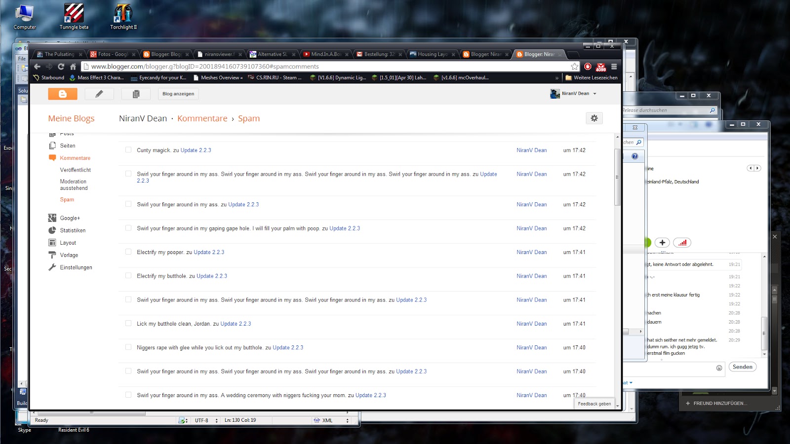
I mean, seriously? 44 spam comments?


the worst of it, this fake account is named NiranV Dean, causing my own comments to be marked as "Spam"...

44 Comments about all sorts of gay fantasies someone is having (i most likely know who's doing it anyway). Is this really necessary? Someone must be REALLY bored to do this nearly every day, with every post i write.

Update 2.2.3

Fixing time.

As promised i have been working on fixing some stuff and bringing the Interface up to date with older Nirans Viewer builds, i think you will be happy with the new(old) stuff.


User Interface:


The Navigationbar has been overhauled alot, the balance thingy shouldnt overlap the rest anymore, the balance icon has been changed and our lovely quick Windlight buttons are back aswell as my much needed quick Searchbar.

People was bugging me extremly because it simply looked way too grey and misaligned, space wasting and broken, i fixed the avatarlistitems, included the "always show permissions" fix i made and generally changed everything a bit here and there to make People look like a nice and clean panel.


The RegioLight or "use region time" button and the "use daycycle instead of fixed sky" checkbox should now work as intended, they might bug out a little bit at start but, going to another SIM and clicking stuff here and there a bit, switching it on/off should fix it once and for all (might have been just me beeing stupid).

Color Correction in graphic prefs can now be clicked and SHOULD BE if you use Tone Mapping because otherwise it will just look like a bright grey/white broken... thing. Remember that my pictures are all made with Tone Mapping and Color Correction, it does not look like that? Then you missed something.

Some information about that can be found in previous post comment sections

Wikipedia says:
"Tone mapping is a technique used in image processing and computer graphics to map one set of colors to another in order to approximate the appearance of high dynamic range images in a medium that has a more limited dynamic range."

As far as i understand this means translated in common language:
"Tone Mapping is a Post Process Effect that aims at 'equalizing' or 'normalising' colors to a good medium"

You can notice this effect on the sky. The reason i always keep saying that Tone Mapping is supposed to be used with Color Correction and vise versa is that Color Correction how i configured it aims at adding contrast to the picture without destroying the original Tone Mapping effect which could be described as "smoothing" colors. Basically Color Correction adds back in the darkness and brightness but keeps the 'normalised' colors for them, as example you have a bright blue, a normal blue and a dark blue (a sky as example), Tone Mapping 'normalises' these colors by reducing the range between these colors, thus making the bright blue just a 'a bit brighter blue', the normal blue becomes a bit more colorfull and the dark blue becomes a 'a bit darker blue' that will result in a "duller" image but also in a smoother color transition which i think is very important for a nice picture, no one wants color banding, Color Correction will now find and correct other parts of the image like very dark colors (dark grey to black) and makes them "dark" , really dark compared to the overbrightened image without Color Correction, you will now have a combination of a smooth transition between colors and still maintain a "wide" range between colors in terms of having dark and bright stuff.

Maddy also showed me that the minimap looked broken. I tell you, NOT ANYMORE!

With the recent changes you can now also move your floaters over the Navigationbar instead of just below it :P


Rendering:


Not much has been done here as the major graphical changes have been done in the previous beta already but hey know what? You had no options to finetune SSAO and Shadows in any way, that means you still use the defaults which in turn means that you wont need a settings redo to get those new settings i made to fix too sharp Shadows/SSAO. Life can be so easy if you cant break anything.


enjoy,
Niran.

Changelog:


2.2.3 Beta

added quick Windlight and browser icons to Topbar

added quick Search field to Topbar
added a whole bunch of customization Debugs (non functional)
added Minimap chat range rings
added missing icons for Windlight editors
added some missing inventory art assets
fixed Shadows and SSAO beeing way too crisp causing Shadow/SSAO pixelation
fixed Avatarlistitems breaking whenever someone has voice
fixed Minimap background color
fixed a crash when opening water preset editor
fixed Color Correction beeing not clickable
fixed Block list bottom button panel layout bugging out
fixed a crash when opening "Set Window Size" floater
fixed set window size calculation for correct resolution changes
fixed RegioLight and "use DayCycle instead of fixed Sky" buttons
fixed "Click this to refresh your L$ balance" panel overlapping half of the navigationbar
merged CHUI including fixes to allow quitting the Viewer on first try now
changed Topbar layout and brought it up to date with the old style layout
changed People floater layout and made it look nice and clean
changed some loadingscreen tips to better fit the new Viewer
changed background color for all lists to 50% alpha black
changed toolbar positioning a bit so floaters snap closer to the Navigationbar

Sunday, June 23, 2013

Updates.

Blog


Recently i've had an increased number of spam comments from someone naming himself NiranV, which is obviously my name and a try to troll me, therefor i enabled moderation for comments but at the same time i also enabled everyone to write, you wont need an OpenID or Google account anymore, everyone can now comment, that should hopefully help and encourage you to comment more because thats what the comment section is for, those comments must be allowed to be seen however (by me ofcourse)... that should prevent this stupid trolling from happening.


Viewer


I will most likely release updates a bit faster now that some basic stuff is done, the next update will contain mainly UI work and will probably add Pie Menus and those quick Windlight buttons again.


Users


This is a warning to everyone especially those writing stupid comments or starting stupid Group-Chats/IMs with me or my group. I clearly said that this is a beta and a new Viewer but some people dont seem to understand what that means. It means that this Viewer is NOT Nirans Viewer anymore even tho it will contain everything Nirans Viewer did, it is a new Viewer, based uppon Linden Labs Official Viewer (again) and is therefor an (as you call it) empty Viewer, with RLVa ofcourse. Things like "OMG DIS IS SO BAD, I WILL NVR USE DIS SHIET CUZ ITS BAD" will help no one, especially not me. All you manage to do with this is make me angry and sad about wasted time and effort. Not sure what YOU think how a Viewer is made but it definetly doesnt pop up out of nowhere!

Yea i could have just forked Firestorm or Singularity or Catznip or whatever else Viewer to have a fully fledged, complete Viewer with all kinds of stuff but those Viewers are not what i want, i dont want to make a Firestorm², why should i? Why should i include all these Firestorm features? Why having 2 Firestorms? Isnt one burning your ass hot enough? Why GENERALLY doing a fork of another Viewer and only changing a few little things? I dont see a reason here to do so.

So back to the topic, what i want is a custom Viewer that is designed for my needs and ofcourse yours partly, if i wouldnt design it for public use i probably wouldnt even do anything on it anymore because it has everything i want already, everything it has right now is fine enough for me to survive SL for the next few years. Some of you think they have some sort of special previleges to tell me what i have to do and what this Viewer should look like. I tell you something.

F.U.C.K.Y.O.U.

Super-resolution birdy. Just. for. u.

That also counts for people who dont read my blog and/or dont understand what it means when i say:

I HAVE DONE NOTHING ELSE THAN MODDING CHUI IN THIS RELEASE! DONT EXPECT A FINISHED VIEWER!!!!

Want an example of this?

Tomb RaiderWednesday, May 22, 2013
alright I just download and test it out and I am pissed off that I can't find my sky wind lighting setting nor the animations speed tools and second I wont be able to do my sun lighting animation work unless im on Niran's Viewer or if LL make the damn Layouts a Bit Smaller or something (Like Niran's Viewer is set)I will not be using Black Dragon Viewer Ever Never Ever until this is fix or I am Leaveing Second Life For Good Fuck that LL I fucking hate you so much grrrrrrrr Fuck CHUI kiss my ass

What. is. so. hard. to. understand. that. this. is. ONLY. a. modded. CHUI. release. totally. unfinished. and. not. the. final. Viewer. WTF.

No seriously. If i ever see comments like this again, i swear to god, you can kiss my fuzzy ass then.

For all those nice little buddies who continuesly try to help and enhance stuff here and there, those who contribute to the development by reporting bugs, giving constructive critism. THANK YOU. Im sorry for those, because THOSE will be people who will lose their favorite Viewer prematurely because of stupid people.


I hope i made everything crystal clear.

Niran.

Thursday, June 20, 2013

Black Dragon - Materials Beta 2.2.2 (3.6.2)

As always, be carefull what you do, clearing Cache and Settings will usually fix MOST problems. Try out Materials which is now officially out!

Time to break a sweat.

She is here, the ultimate graphical NUKE of fancyness.
Just joking.


Theres not much to say, the changes are listed below and the rest... well... just watch the ultimate Trailer of all Trailers:


and...im working on something but i wont say much about it yet, i will come back to it when it is on the best way to get done for real.


Screenshots:


as always, enjoy,
Niran.

Changelog:

2.2.2 Materials Beta

Fixed Webmedia and Websites using a UI size dependant zoom
Fixed topbar showing its grey background after leaving Mouselook
Fixed random crashs on TP caused by Achievement code
Fixed Viewer/OS hanging/freezing due to total GPU overload caused by sculpt/prim crasher/spammers
Fixed sometimes bugging Web-Profile layouts
Removed the Environment Cube Map in Deferred shiny (restore shiny back to original)
Merged and fully integrated Materials support
Changed Permission icons to Nirans Viewer style
Changed Male/Female icons to Nirans Viewer style
Changed "Set Window Size" floater to Nirans Viewer style
Changed "World Map" floater to Nirans Viewer style
Changed "Shoe" icon to "Shoes" and make it use a "Shoes" icon instead of only one shoe
Changed several basic UI widgets to Nirans Viewer style (temporarly)
Changed floater textures
Changed FXAA's edge handling a bit
Changed Inventory's minimum size
Changed Loginscreen to Nirans Viewer style
Changed to self-build FmodEx package
Changed SSAO default settings to Nirans Viewer's defaults
Changed Shadow default settings to Nirans Viewer's defaults
Changed Shadow look and quality in shaders to Nirans Viewer style
Added Windlight transitions
Added "Refresh" button to UI Preview
Added left/right Shoulder View Camera preset
Added preloading of 3 random loadingscreen images
Added all Nirans Viewer loadingscreen images
Added FPS counter to topbar
Added Draw Distance slider to topbar
Added Show/Hide HUD Attachments option to main menu
Added Several some new options to main Graphics panel for Color Correction and Tone Mapping
Added Exodus's Post Process Stack minus Gamma Correction which is default due to Materials

Tuesday, June 4, 2013

Black Dragon 2.2.1

DO NOT change CHUI settings, DO NOT use old settings, DO NOT do anything that breaks this highly fragile CHUI shit.

Blablabla,

CHUI changes, finally some UI changes, skin changes, alot things are still untouched, expect bugs and broken UI.

Most importantly: ITS NOT YET DONE.

there, have a pic of the current UI.


here, take the download and stop asking me for an update ok? this thing is so up to date that it has changes i havnt even yet written down nor commited to my repository because im waiting for other things to be finished first so i can wrap them up nicely.

Tuesday, May 21, 2013

Black Dragon Beta

NOTE: DO NOT, NEVER, EVER, WHATEVER YOU DO, CLOSE THE NEARBY CHAT UNTIL I MADE IT PROPERLY HANDLE IT!

phew.

A whole weekend of nonstop coding and hacking and cracking and hammering and... you know... generally tearing CHUI apart is finally ready to try out!

This beta is ONLY a preview and is ONLY meant to show what i'm doing with CHUI right now and how it will be (most likely) implemented into my new Viewer. So... feedback needed.

Old Viewer is still available via normal download link, this Viewer has a whole new Project Page therefor a whole new Download section and should prevent you from accidentally downloading this Viewer instead of the original one.

NOTE: Try out the ORIGINAL CHUI from LL first, you have to know how the original one was before you can say what is better and what isnt (obviously). You can find CHUI in LL Release or Beta Viewer. I HAVE DONE NOTHING ELSE THAN MODDING CHUI IN THIS RELEASE! DONT EXPECT A FINISHED VIEWER!!!!

I suggest you to layout CHUI like this for an ideal space usage and a pre-CHUI behavior.


Friday, May 17, 2013

Nirans Viewer <-> Black Dragon

I'm in a very good mood for some reason, don't ask me why, i know that it won't stay for too long but i want to talk a bit about my plans, they are huge!


Nirans Viewer will be no more...


Soon. (aprox. 30 weekly Betas from here) 2.5.0 will be the final Release this Viewer will officially see, after which i will continue privately (because otherwise i would have to use another Viewer), not sure if i will ever make them available for the public again, the source however will and must stay available to everyone, that means everyone who feels the need to do so can just compile my latest code (which will ofcourse get updates because i love pushing stuff to bitbucket =3). How long will it be until then you may ask... aprox. 30 more Betas of which each is released weekly, 30 more weeks to go, thats still more than half a year and i'm not even sure if i can afford this time so this might change.

So why am i saying that the Viewer won't be anymore but at the same time i say there will be still 30 more Betas? Because the Viewer as you know it right now will not be continued anymore due to several reasons...

1. CHUI.
2. Random FPS drops in Deferred (for me and some other people)
3. I want to redo alot parts of the Viewer.

The Viewer as it is now was always build for minimalistic needs and maximum effectiveness aswell as minimastic but still fancy UI design, while LL continued to waste 600x800 pixel per window on your screen, i was minimizing space wastage, that worked pretty well but right now i'm totally sick of it. Minimalistic UI design also means alot of limits and i hate limits because limits are in some cases just stupid and unnecessary!


<-> Black Dragon???


Black Dragon will be the new name, no more Nirans Viewer, it sounds selfish and stupid, it also reminds me of a certain guy...


So, what am i going to do with it? Alot. I will redo the whole main UI and with it probably revisit every damn floater to work with the new planned style, thats alot work and will take probably several weeks but i dont care, i want something truly different, something no one would ever do (most of my old stuff wasnt done by anyone else too...but, it was just... a game, a little game, a piece of what can be done with the UI and i want more, not just one piece, i want ALL OF THEM :)


User Interface redesign ideas...


This is a work in progress UI redesign, im extremly happy that most stuff works as intended right now, the right upper part will make problems however. This is mostly static, the buttons at the top left and below the navigationbar are all unmovable and unhidable but honestly i dont care, really. It looks better with them and it still wastes less space than... fuck this, i dont care about space anymore!

Next topic on my list are the "Achievements", YES ACHIEVEMENTS, i implemented them long ago but some of them were broken, they didnt tell you when you finished one and the achievement floater simply looked....simple...i'm going to change that, i will make every achievement repeatable, they will award points and they will notify you when you finished one (hopefully). Coupled with a RLVa-like system those points could be used in a inworld store from me to get some cool stuff...or...they could be just e-peen extensions.


CHUI. Yes i know what you think... but you said "I will never ever implement this piece of shit.". Yes, but i have to, no way around it. Coding a way around it is something Firestorm can do, but not me, i dont have time, will and or knowledge to recode literally the whole chatsystem to work like the old V2 system and still include all the new stuff of CHUI, i will simply bash it in and make it work better... as good as i can.

Preferences floater and the panel as it is right now are both somewhat a huge mess, the floater doesnt offer enough space without doing dozens of ugly tabs and the panel right now doesnt quite work like it does in games because SL's User Interface scaling works totally differently than that of games, therefor i will totally redo it and mash it all into the sidebar, yes, you heard right, a sidebar just for preferences! It will ofcourse always open the graphics panel by default because it should somewhat stay a machinima sidebar. 


Explain ALL THE THINGS!


After the Viewer reaches a somewhat "finished" state i will start to do a huge "Walkthrough" for my Viewer that will explain all the things, why is X there, why is Y not there and what does Z? Hopefully everything will be answered. It will contain bugs and their solutions if there are any. It will also contain pictures, lots of them... comparison shots and explanation pictures.


Topbar, Toolbars and no Toolbelts...


As you might have noticed in snapshots above i'm going to throw out the old cloud and topbar design and replace it with something hexagony (what a word...), toolbars left and right will work just as before, top and bottom will probably get a double toolbar which allows them to have those "connected" hexagon buttons with offset, not sure yet tho, will have to see how it turns out. I also kind of grew sick of having to iterate 3 different files to make changes to the topbar, i will simply combine it all into one single file, this should make things alot easier.

I might also do reimplement the autohide function and extend it a bit, make it fancier maybe. I want shit to blow minds!


Misc informations...


The new Viewer will include and exclude pretty much everything it does now, RLVa, SSB, pie menus, lots of customisations, tons of graphical fancyness and soon also CHUI and Materials, i will want to make the last release a nuke, not just a bomb.

FEAR ME SL VIEWER AS I WILL TORTURE YOU *SQUEAK*

Thursday, May 9, 2013

2.2.0b (2701)


So... i hope this will be the last Alpha for now...


All i did for this Alpha was merging up the rest of SSB and some additional fixes not even FS has at least not yet visible in their public repository :P

Anyway, SSB works fine now, i can switch outfits as much as i want and they will bake extremly quick, it might take a few seconds sometimes, dont be scared.

I tested both Hippo Hollow which is (Second Life RC BlueSteel 13.05.04.275247) and i tested Hazzlehoff, my favorite emergency place which is using (Second Life Server 13.04.29.274986), both of them were baking my Avatar just fine. I just dont know if its visible to others aswell heh... havnt had anyone checking my Avatar all the time but i didnt hear any complains when i was near people... so... i guess its fine.

I also added the much requested Land Info quick button back (temporarly until i implemented it into the navbar itself), you can either right click and enable it or go to Preferences to do so.

Note: This Alpha was not even intended to contain anything else than JUST merging up the rest of RLVa/SSB. I got plans on what im going to do next, i will explain them in the Beta post.

Snapshots:


Sorry, no super special ones, they will be shown on Beta post :P


And yes, this is real shader based greyscale :P, lights are the interesting part about it, they make stuff around them colorfull again as you can see in the last snapshot.


Changelog:

2.2.0b Alpha

added land info quickbutton to statusbar
merged SSB
fixed alot cases in which avatar wouldnt bake
cleaned up code a bit and tagged some things that needed it